We first started off branching from 5 a day and we eventually felt like we were getting too stuck around the whole concept of 5-a-day been from the origins of it been the fruit and vegetable guideline set by the government.
Mostly due to how much it was marketed, first introduced into the UK (USA and Germany!) in 2002, after 10 years it's very much ingrained into our culture. Even if no one does follow it.
We decided to make something that would be relevant to most people, as trying to stay healthy with fruit is a more than overdone topic. The idea we came up with was to take the 5 a day approach towards Social Networking as more than most people use it.

We identified all the different possible social networks that we could use to research into and all the different activities you can do on each. The 3 big contenders been Facebook, Twitter, tumblr.


We decided to tally how many times we visited our favourite social networks for one day and I came off with:
Facebook: 34
Reddit: 32
The results were similar throughout the rest of the group:
Joe:
Facebook: 36
Twitter: 22
Instagram: 14
Buzzfeed: 2
Anna:
Facebook: 24
Emily:
Facebook: 30
Grace:
Facebook: 25
Twitter: 10
Reddit: 1
Twitter: 10
Reddit: 1
We're all addicted.

We then looked at the different sides to social networking sites to discover any problems we could solve or figure a way around to solve. There seemed to be equally good as much as there is bad between them. However there was significantly more bad/negative aspects to Facebook than Good. Which kinda says alot about it.

We came back together to create another spider diagram to brainstorm ideas, focusing still social networking and 5-a day. We came to the conclusion of using Social networks 5 times less a day.
We thought a good way to show this was through a possible app, so me and Joe both created this mock-up of how it would perhaps wrok which were then later developed by Emily for the Crit


I've not really looked into how different elements of an app/website work and since our idea is to create a app/website to display information on a person's addiction of Facebook (currently, twitter is our next idea to develop onto if it works out) These images are research and inspiration for how different UI can be designed within the app, examples I think work really well or show something different.
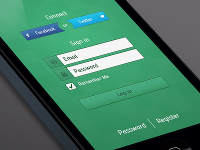
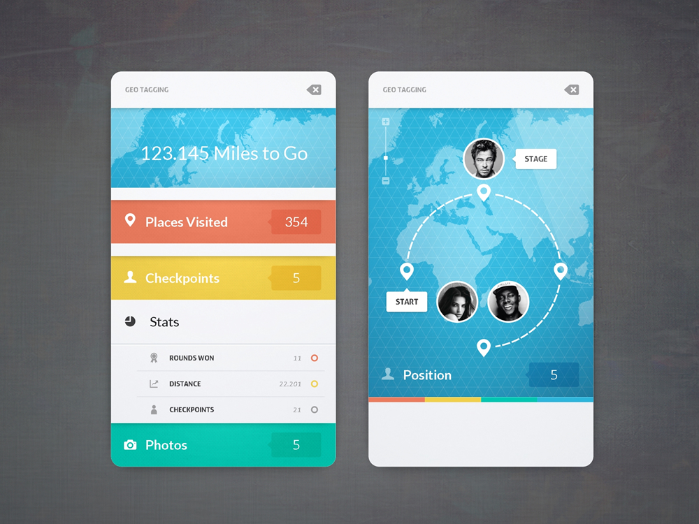
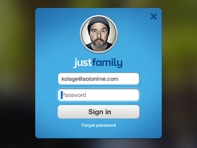
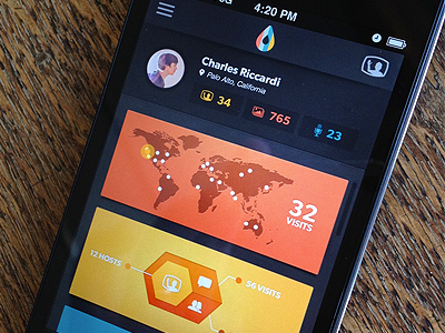
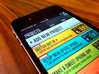
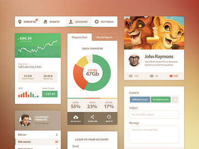

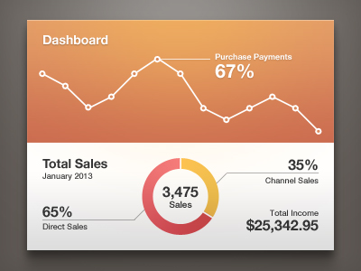
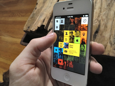
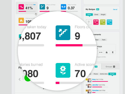
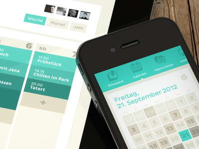
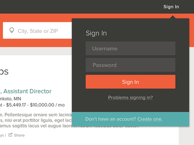
Source: Dribble.


