What are drop caps? With a drop cap, the initial sits within the margins and runs several lines deep into the paragraph, indenting some normal-sized text in these lines. This keeps the left and top margins of the paragraph flush.
How to put drop caps in InDesign
Drop cap formatted automatically by nested character style
Create a character style that has the formatting you want to use for the drop-cap character.
Do one of the following:
To apply the drop cap to a single paragraph, choose Drop Caps And Nested Styles from the Paragraph panel menu.
To nest the character style in a paragraph style, double-click the paragraph style, and then click Drop Caps And Nested Styles.
Specify the number of drop-cap lines and characters, and then choose the character style.
If the drop cap is aligned too far away from the left edge, select Align Left Edge.
Selecting this option uses the original left side bearing of the drop-cap character rather than the larger value. It’s particularly useful for drop caps formatted in sans serif fonts.
If the drop cap character overlaps the text below it, select Scale For Descenders.
A box is a square format layout which can consist of any medium (image/text for example), useful in InDesign for guides and layout.
What are rulers?
Rulers are straight edge guides which help in any design formatting and development to keep things straight and easily measured.
--- What is a double page spread?
A double page spread is a layout that covers two facing pages that is usually in a newspaper or magazine, the textual material continues from the left hand side to the right hand side depending where it's made. (eg manga: right to left.) What is a grid?
A grid is a made from horizontal and vertical guides that help organise and balance the content of a page. It's made up from margins, gutters and columns which help the designer align their content to the associated rows and columns. Margins
The empty spaces that take hold around the edges of a page are the margins, the top and bottoms are often occupied by headers and footers. They influences primarily how text is read on a page and is often wider on the outer margin to make room for the fingers. Often influenced by the content. Gutters Gutters are the inside margins in a double page spread, they are the blank spaces on the inside of a double page spread, as well as that they are the space between two columns or rows. Columns Columns are the guidelines are vertically on a page, they add structure to text and split it up and page content. Golden Section The golden section is the golden number, it's a easy mean to creating a very balanced page layout by simply dividing the page length by 1.61. Pagination Pagination is the splitting up of information and content, an example of this would be on a webpage where all the buttons for different pages are all separated and split up (Home, about, store, etc.) Subheading Subheadings allow for detailed information quickly and add more detail than a heading or title.
Paragraph A paragraph is a section of writing that is usual revolves around a single theme and is often indicated by a new line and indentation. Caption A caption is a description usually underneath an image, used often within magazines and newspapers to draw the reader in. Ligature A ligature is made up of 2 letters or more that are joined up together to make them look more attractive on a page, purely an aesthetic choice to make the letters more pleasing to the eye. Pica A type measurement. One Pica contains 12 points. Pixel A pixel is a sample of a rastered image, used in a 2d grid using a circle or a square. Smallest element of an image available. A physical point in a raster image, or the smallest addressable element in a display device; so it is the smallest controllable element of a picture represented on the screen. The address of a pixel corresponds to its physical coordinates.LCD pixels are manufactured in a two-dimensional grid, and are often represented using dots or squares, but CRT pixels correspond to their timing mechanisms and sweep rates. Bit A bit is the basic unit of measurement in computing, and it can only have a value of 1 or 0. 8 bits make a byte. In computer graphics, color depth or bit depth is the number of bits used to indicate the color of a single pixel in a bitmapped image or video frame buffer. This concept is usually quantified as bits per pixel (bpp), which specifies the number of bits used. Color depth is only one aspect of color representation, expressing how finely levels of color can be expressed (a.k.a. color precision) ; the other aspect is howbroad a range of colors can be expressed (the gamut). The definition of both color precision and gamut is accomplished with a color encoding specification which assigns a digital code value to a location in a color space. It is better to edit a 16 bit photograph (raw file) than 8 bit (JPEG) in Photoshop because there is more flexibility. You don't lose as much detail and there is a smoother transition. Point A point is the smallest unit of measurement in typography. 12 points make a pica. It is the usual unit used for measuring font size and leading. It is important to remember that it measures the height of the type block not the letter itself.
Greeking Greeking is using lorem ipsum as place holder, this is used to help design page layouts before the content is actually there so you can decide before hand what fonts and typechoices to do. By doing this you are forced to concentrate more on the layout than the content.
We then left out a piece of work to receive feedback on, I left out these layout examples, with bill murray as a place holder, I made these for the Design practice animal double page spread task as a break in to seeing what layouts would look like.
My feedback was:
Include more images, but brillant outcomes so far!
Fantastic range of layouts, I wouldn't change anything.
I like the far right two at the bottom, maybe experiment with more ways of laying out the text rather than just 3 vertical columns.
-
The black one was the most useful because it gave me an idea of what was bad and where i could improve whereas the others only talked about the positive, not constructive.
On the day of print for the stickers, I brought together all the work people had done for the stickers: (Me, Anne & Grace), below is the stickers I had created to be made as well.
I wanted to make an adaptation of the current logo we had, the one made by joe and try and create a new perspective for it so It'd work as a sticker that was more fun than just a logo.
I had some trouble with the beak silhouette and trying to get the angle of it right so I scrapped these.
I thought these ones were a lot more effective and overall worked in sync with the logo a lot better, I saw the flying birds as more of a icon to combine with just the logo then how these ones incorporated it.
I had to also create a mirrored version of Emily's logo so that we could have two versions of each logo so that they would all work in whatever situation, and together with the flying bird one. So when they came together the speech bubble was always coming from his beak which I thought was rather cool.
These are the final stickers that we brought together, the eggs at the bottom are both from Grace and Anne.
This is how I had to lay them out in digital print because of their sizes this was an absolute pain to setup, We did it like this to be a lot more cost effective as the sticker paper was really expensive and Isn't something I would want to do in bulk next time as it just cost so much in-comparison to everything else.
I had 2 different types of stickers printed, transparent and opaque. For use on different areas. So opaque on walls while transparent on bus stops.
Part 3: The processes used in print have changed the way type was developed, with people learning to read there was now a need for methods of print to make things available to read for them. Type is the visualisation of speech and spoken word, it makes sense because of this to have different typefaces to illustrate the different accents and dialects to simulate the way we speak. Each character we have created is the illustration and representation of a sound. A Typeface is a collection of characters, numbers and symbols, all of which follow a distinctly similar design. A Font is the way in which a typeface is used to be made. Eg: Computer code, film, metal, wood.
There is multiple weights to a typeface.
While the weight of a font is all the same.
There exists multiple families to a font, so for example:
Thin
Light
Regular
Italic
Bold
Condensed
These are all different font families, these can be combined to create more as well. So for another example you can have 'Thin condensed bold italic' and these would be a completely different font family to just Thin.
Regular is the initial design of a font.
Part 4: The legibility and Readability of a font. The spacial quality is the negative space within the counters in the letterforms and is one of the most important factors when it comes to readability within a font as the counters are what help us read the letterforms and distinguish them from all the others.
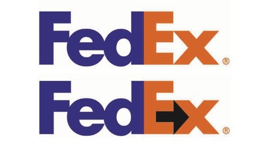
The Fed-ex logo is a good example of creative use of negative spacing in the counters, the space between the E and X creates an arrow.
The logo for the Office of Government Commerce is on the opposite end of the spectrum, made for £14,000 and made to represent the companies aim of:
“improving value for money by driving up standards and capability in procurement”.
This is just one example of where the negative spacing and counters can end up going terribly wrong.
However, at the end of the day it doesn't really matter what order the letters are in as long as you leave the first and last letter in the same order as you can still read it as the above image proves. The brain doesn't read the word rather it sees it as an image and then signals it's meaning to you in the split of a second.
Because of this effect people often find that Roman (Serif) fonts easier to read other Gothic (Sans-Serif), the serifs been easier for people to read at smaller scales than gothic because of the serifs help distinguish the letters at a much smaller scale (Best at: 9-12pt) while Gothic is better to read on a larger scale (10-14pt) for reading.
Script and block typefaces are not made for body copy however, they're made to be for display so for things such as headers and titles. Because of the negative spacing in words it's alot more easier to read words with counters that are large because it gives the characters some extra readability. When you bolden a typeface the spacing between the letters is extended to increase readability by increasing the negative spacing.
Legibility is how well you can you understand and recognise characters and glyphs.
Readability is how well you can easily read the text.
Leading is the space between each character.
Tracking is the act of adding in lead to between the letters.
Kerning is the act of removing the lead from between the letters.
'Work the metaphor. Every object has the capacity to stand for something other than what is apparent. Work on what it stands for.'
Incomplete Manifesto for Growth
Imagery can be used to communicate messages and the different devices that can be used to convey said messages. These are the visual semiotics:
The Visual Semiotics
A Visual Metaphor is used to transfer messages from one image to another, draws comparisons between the two to create a new image.
A Visual Synecdoche is used to represent something that is a part of something, which in turn is representing the whole image. Works only with images and subjects that are widely known so the connection exists. (Statue of Liberty = New York)
Visual Metonym is a symbolic image that is used to reference something more literally. (Yellow taxi cab = New york / Star of david = Judaism)
Type can be effected in all manner of ways, these all affect the way we read due to the hierarchy in which they are presented, these different effects can manipulate how they're read.
Legibility
Readability
Scale
Bold/Light
A good example to find this from is Newspapers as they use multiple weights and effects to push forward specific text to grab your attention.
'If you can't make it good, make it BIG. - If you can't make it big make it red!'
Rob Roy Kelly
Emphasis, pace and volume are all determined by hierarchies too, the spacing, scale, kerning all affect the ways in which your read the words. Videos where you can see this in motion is in Kinetic Type videos.
There's a really good pace to Costanza telling the joke throughout this sketch and It's been executed well in the video to show his pacing, volume and emphasis.
For this session we were tasked to create the sentence 'Who are you?' in light, regular, bold in 24pt, 36pt, 72pt and at 144pt Then to have them all cut up into the different words as they are seen above.
In class we had to read them out after mixing them up and changing the orders of weights and pt sizes, going around the table. It was really cool, because this highlighted the same thing the kinetic type video showed off, the emphasis we place on words that are bold and big. But it did bring into question what happens when something is big and bold and small and bold. What we thought we were trying to say didn't come out and that created some differences in how we were trying to perceive what they word order they were reading was.
For the next session we had to do the same, but find a typeface that represented the accent with it using the below list... So for Scottish find a typeface that reads off been Scottish, etc. This was because, even though we can change emphasis and speed, you can also affect the dialect of the type depending on what it looks like through it's typeface.
Scottish
South African
Italian
Texan
Mexican
Somerset
Brummie
Cockney
German
Chinese
Swedish
With the examples we brought in, we swapped tables to get a new load from a group. We then had to sort these into all the different accents without knowing which one they were for. The really hard ones to identify where the regional accents, summerset and brummie especially as there is nothing to really identify them you had to work of someone else's perception of what they though it visually would look like as a typeface. Easier ones to identify were Chinese, Texan, Mexican, German because these all had very distinct associations that everyone else can agree with in the aesthetic of the typefaces. The German ones were mostly black-letter, while the chinese ones were crude english typefaces looking chinese.
After that we made 5 rules about typography in our small group, these were:
1. No more than three typefaces in one piece of design
2. Never use a block font in body copy
3. Never use a script font in body copy
4. Don't track or kern too much
5. Don't increase or decrease the leading excessively in body copy


.jpg)