Monday 29 April 2013

Tweet 5: Logo Design


I saw Joe had posted a picture of the logo design's he was working on and I decided to try and come up with my own solution because I thought he was onto something with his design's. I choose to try and take further the Owl picture he drew at the bottom right. Its face more specifically. It was over-complicated, so I wanted to reduce it.


Below my design sheet:


I started in Adobe Illustrator using the basic shapes to build It up first, although I had done this through my drawings, the end result like this was a lot more pleasing I thought.


 Although Joe had the idea of an owl, I was interesteed how this could be taken with other birds, but in the end decided to stick with it, or the silhouette I had created of it as It had the biggest impact of all the different character combinations.


 I tried to experiment more with the character but It was hard to take it further then the original shape combination I had first concluded on, so I eventually returned back to this.


Which was this:


I then experimented with how well it operated when colour was introduced into it, as I use yellow as my colour of choice to work with when using illustrator. Easier on the eyes then pure white. Joe had taken one of my original designs and experimented with that alone and created his own outcome from mine.  I supplied a huge list of combinations of HEX codes for us to all use and this came in really helpful as it's one of the easiest to give to each other other SMS and have a result thats all the same.

The group, I decided on his, I believe this maybe because It was a lot more fun and appealing over my version. I'm not sure.

The type logo seen in Joe's outcome was supplied by Emily who had also been working on a logo outcome. This was then integrated as the Typographic logo companion to the icon.


From an idea I had on my design sheet, I really wanted to create a pattern using this logo as I thought the eyebrows would work really well together to create a pattern, so I did this too. But We never found a use for it at such scale. It late became part of the twitter background page, but the pattern wasn't so apparent.


Which can be seen here. Also on the twitter page, I also helped update the look of it, Anthony had created a 3D render for the main section but I didn't think It worked so create so I created the Orange block to help fit in as well as supply the correct resolution to the logo as the previous alliterations had all been seemingly low-res whoever uploaded them.


Monday 22 April 2013

Speaking from Experience: Making of


From the images I took from the supermarkets I then used them to draw up little illustrations to create for a initial idea for the shopping lists.


I used a notebook to print onto the pages and put them in which is really useful. I thought they looked really good.


The card I found in the Library  Ultramarine I found to be very vibrant and enticing so I choose to go with this as It's rather gender neutral. 


I made a shopping list mock-up, I really loved how this one came out I thought it looked rather professional.


As i wanted to make a band, I found out about foiling and I thought it'd really finish it off so I did gold but I seemed rather too fancy so I did it in black foil which made it look a lot better as it was rather like spot varnish!


I printed my pattern onto the card I had, I got some yellow card: Mango paper from the library which really went well with the blue. Think it may go well with as a band around it.


I created a sample and They worked really well together! (varnished)


I then did all the other illustrations, so I could finish of the rest of publication.


I made a prototype band which I thought looked pretty good, from this I could figure out the measurements.


Here's the final thing in photos:


Thursday 11 April 2013

10 Things: Publication

I was dead set on creating a concertina booklet, mostly because of how practical it would be to easily fix all the double pages together, so I opted to go with this and because it would end up cheaper.


I made the images for the Visual semiotics first using London as the first location, I wanted to make them straight to the point, and have this carried throughout the publication. Making it appear clean and appealing.


I'm really happy how successful this one came out, I thought it nailed the idea of what I was doing it for. The CMYK / RGB page. I wanted it just to explain what they were used for and this was the result.


 I got really stuck on this for a few hours, I thought hey yeah maybe typing out Type Anatomy would convey it. It was boring. I exchanged it with the design below and I'm rather glad of it. It just works it alot better. This is where I got the bee colour scheme from that I really liked after playing with indesign's colour palette.


After:


 I hadn't really used indesign before, Phil's lesson really helped out, using the guidelines really helped out, I aligned it all to them, I wasn't till after there was an easier way of setting out so I went back on over and redid that. I still feel a bit naive with Indesign because it's new, but it's slowly growing on me.


I make the actual thing, I had to duplex print 3 sheets of paper, which turned out to be really helpful as I was trying to make these on the cheap as well.


I developed my pocket from the topman gift card pocket, as the idea stemmed from there originally.


However when it came to actually making it, I couldn't fit the booklet into it. Shame.


 Instead I decided to create a band, since it'd be much easier to hold it all together, this also meant I could also play about with the design with it so it could interact with the booklet more.


 It might have took 3 attempts but I finally had one fully made.


Tada!
------
10 Things you need to know about Graphic design.


Colour Questions

The 10 questions were:

(Questions that were the same were removed


2. How does black change in as a colour in low light?

It doesn't, black still stays black in lower light. It may appear darker as there's less contrast behind it however making it appear blacker through perception.

5. Do the names of colours change how we perceive them?


Strangely enough it actually does, a good example of this is the Himba tribe, they have half the colour categories as us and subsequently they have a more limited perception of the world around them. 


Cutbit - Himba tribe colour experiment


6. Is White a colour within Additive light or is it considered a combination when you perceive it.

Apparently not, It's rather the presence of all colour frequencies  even though it's a combination of them. It's still regarded not to be a colour itself.


7. Is it better to make the background of something neutral so that the colours stand out more?


8. What colours do we see when we perceive black?


We don't see any colours when we perceive black, black objects absorb the full wavelength of the colour spectrum so what are actually seeing is the absence of light due to it been absorbed.


10. Why is colour necessary if we could live in black and white?


The eight questions we narrowed down:


1.Is colour more less or equally important than 

typography in graphic design?

It would be more important, however that's subjective. I say this because colour can be used as a signifier for symbols, changing their colours can mean different things. This is recognisable instantly. Typography however isn't always necessary while taking into account colour is.


2.Is black a colour?

'To see color, you have to have light. When light shines on an object some colors bounce off the object and others are absorbed by it. Our eyes only see the colors that are bounced off or reflected.

The sun’s rays contain all the colors of the rainbow mixed together. This mixture is known as white light. When white light strikes a white crayon or marker barrel, it appears white to us because it absorbs no color and reflects all color equally. A black crayon or marker cap absorbs all colors equally and reflects none, so it looks black to us. While artists consider black a color, scientists do not because black is the absence of all color.'


So as crayola say's It depends on how you view it, for artists black can be considered a colour, as it's not physically speaking and taking light into the mix. While scientists see black as been the absence of light and to have colour you need light so black would not be considered a colour to them.

3.Why do people have favorite colours?

'Evolutionarily speaking, it makes sense that people would approach or withdraw from objects based on their colors. Bright reds and yellows often mean ripe, delicious fruit, whereas drab yellowish-greens and browns signal ... well, less pleasant things.' (1)

If you're a girl and you liked pink when you were younger, similarly blue for a boy it's most probably down to been surrounded by the colour at that age, as most things are coloured for genders. However children at the age of 12 months, before been to enveloped by this environment both go towards colours that are more reddish rather than blue surprisingly. (2) However when you grow up your favourite colour is representative to something that is pleasant to you or something that makes you feel safe.

5.Why do natural colours fade?


Colours apparently fade due to ultraviolet light, interestingly enough! It's all a bit scientific but I found this which sums that up rather well.


'Ultraviolet rays can break down the chemical bonds and thus fade the color(s) in an object - it is a bleaching effect. Some objects may be more prone to fading, such as dyed textiles and watercolors. Other objects may reflect the light more, which makes them less prone to fade.'

So if you're after something that'll be in the sun, remember to make it plastic or metal they're alot more reflective to ultraviolet, where as textiles fade because of they absorb alot of them.


7.What's the best light to look at colour in?

It depends what colour you are observing, colours will be perceived differently under all lights. However the best place for looking at colour, that you can come back to is under a constant light. (Lightbulbs) Natural light outside is forever changing so trying to observe colour at noon won't be perceived the same as it is at dusk. So stay indoors.

8.Which colours look best together of them all?

There's no science to what the best to colours together are, using colour theory you could quickly find pairings of colours that go well together however such as Blue and Orange.


5 questions from other group: 


1. Does looking at colour through one eye affect the way you see colour compared to the other eye?


As our eyes aren't exactly perfect, since nature rarely does anything identically our eyes have slightly more or less red, green or blue cones in either one of our eyes. This leads to our eyes seeing more of one colour than the other eye since it's more sensitive to that colour, an eye that sees red better has more red cones in it for example. The reason we don't see this imperfections when we're seeing through both eyes is because our brain is able to sort the good and cancel the bad out so that we can see without them, It's only when we look through one eye that we see these differences.


http://www.newscientist.com/blog/lastword/2008/03/rose-tinted-vision.html


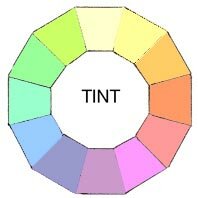
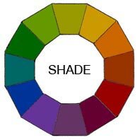
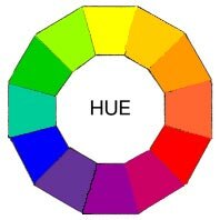
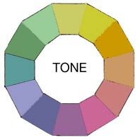
2. What is the difference between tint and shade/ hue and tone?


Tint:
What's a Tint
A tint is the whitening of a hue, it's any colour with white added into the mix.

Shade:
What's a Shade
A shade is the blackening of a hue, it's any colour with black added into the mix.
Hue:

What's a Hue
Hue is in reference to the colours themselves, so the root of Maroon would be Red. Hue is simply a way to describe a family of colours, likewise the word Hue and colour can be used interchangeably.

Tone:


What's a Tone

A tone is the greying of a hue, it's any colour with black and white added into the mix.


3. How crucial is it to learn colour theory?


I would it say it's pretty crucial especially when it comes to doing an art based degree formally, in essence it can be summed with this quote on it's purpose: "The principles of color theory are used to create color combinations that are considered harmonious to the eye." It's used to make e


4. Is it possible that there are colours that exist that the human eye cannot process?


I really like this question and it turns out, yes there is actually. 'Impossible colours' well colours we can't see, but do exist still. Easy to note examples such as infrared and ultraviolet exist, but there's also more colours than that. One way to attempt to perceive one of them is through the the boxes below, if you cross your eyes.


5. Is colour theory learnt or is it just instinctive?


Colour theory is learnt, you can't just know about it without discovering it or finding it out. Same with the Laws of physics  you're simply made aware and start to perceive it once you've been told of it. You may combine colours harmoniously instinctively but you won't be aware that what you would be doing is colour theory.