A Typeface is a collection of characters, numbers and symbols, all of which follow a distinctly similar design.
A Font is the way in which a typeface is used to be made. Eg: Computer code, film, metal, wood.
There is multiple weights to a typeface.
While the weight of a font is all the same.
There exists multiple families to a font, so for example:
- Thin
- Light
- Regular
- Italic
- Bold
- Condensed
Regular is the initial design of a font.
Part 4: The legibility and Readability of a font. The spacial quality is the negative space within the counters in the letterforms and is one of the most important factors when it comes to readability within a font as the counters are what help us read the letterforms and distinguish them from all the others.
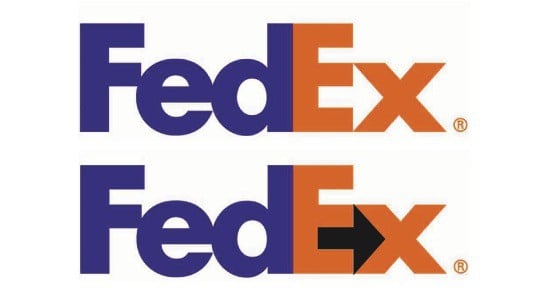
The Fed-ex logo is a good example of creative use of negative spacing in the counters, the space between the E and X creates an arrow.
The logo for the Office of Government Commerce is on the opposite end of the spectrum, made for £14,000 and made to represent the companies aim of:
“improving value for money by driving up standards and capability in procurement”.
This is just one example of where the negative spacing and counters can end up going terribly wrong.
However, at the end of the day it doesn't really matter what order the letters are in as long as you leave the first and last letter in the same order as you can still read it as the above image proves. The brain doesn't read the word rather it sees it as an image and then signals it's meaning to you in the split of a second.
Because of this effect people often find that Roman (Serif) fonts easier to read other Gothic (Sans-Serif), the serifs been easier for people to read at smaller scales than gothic because of the serifs help distinguish the letters at a much smaller scale (Best at: 9-12pt) while Gothic is better to read on a larger scale (10-14pt) for reading.
Script and block typefaces are not made for body copy however, they're made to be for display so for things such as headers and titles. Because of the negative spacing in words it's alot more easier to read words with counters that are large because it gives the characters some extra readability. When you bolden a typeface the spacing between the letters is extended to increase readability by increasing the negative spacing.
Legibility is how well you can you understand and recognise characters and glyphs.
Readability is how well you can easily read the text.
Leading is the space between each character.
Tracking is the act of adding in lead to between the letters.
Kerning is the act of removing the lead from between the letters.


No comments:
Post a Comment