CMYK and RGB are the two main colour modes you will come across, although there exists more than these two, they are the two be concerned about when creating different outcomes and media. CMYK is for printed media (Posters, Magazines, Wallpaper) while RGB exists solely for digital and light media (Projections, Mobiles, Screens). How you decide on what mode to choose depends on what you are wanting to create because of this.
Red, Green, and Blue are the "additive colors " - combine red, green and blue light, and you get white light. Cyan, Magenta and Yellow are "subtractive colors" - if you print cyan, magenta and yellow inks on paper, they ought to absorb all the light shown on them. Marvin's CornerBecause RGB is light, effectively when the colours are combined they create white light, how these combine however is how the multiple different colours are created. With CMYK, because the colours are created through pigments, inks and toners they are been produced by adding one on top of each other, with all colours together you would create black.

If you were to accidently produce work in RGB to be then printed in CMYK you would have the resulting colour differences occur, the image will appear severely desaturated because the document will have been set to show colours you are seeing for how they should appear on screen, only by turning it to CMYK from the outset will you get the colours you want correctly. You can't however change RGB to CMYK perfectly because some of the effects carry over.

2: Type: Readability, legibility:
Legibility can be defined as the ability a human reader to read something without effort. It can depend on many things. Often, the size of font chosen restricts legibility. For our purposes though, legibility is discussed in light of typeface choice.
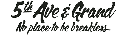
Readability can be defined not on a letter by letter basis, but how he combination of letter are read within a larger body of text. In other words, readability is defined by the amount of effort one needs to make to read text, not single characters. (Source)It's important to know the difference between the two, if something is Illegible you can't make out what the letters are, readability is how easy it is to read. If something lacks readability it's becomes difficult to make out either. It's important to know the difference when it comes to making your type choices, if something is going to be at a distance and needs to be read you will need to use a blockier/sans serif typeface because they're more legible at a distance. While serif typefaces are at smaller sizes the more readable due the serifs guiding you from letter to letter.
It's important to know the difference between readability and legibility; readability is how easy it is to read a passage of text while Legibility is how well you can make out the characters. These two distinctions are very important, as readability comes to play more in books when reading pages while legibility plays it role when you need large display fonts to be read.
Readability can be defined not on a letter by letter basis, but how he combination of letter are read within a larger body of text. In other words, readability is defined by the amount of effort one needs to make to read text, not single characters.
can be defined not by the individual characters, but on how well combinations of letters are read within sentences and larger bodies of text.
Legibility It's how well individual characters can be read, this is mostly down to typeface and size.

The above makes a great example of illegible type-work (right page) because it's difficult to make out what it says.

While here the type is unreadable due to it been produced in wingdings.
'Work the metaphor. Every object has the capacity to stand for something other than what is apparent. Work on what it stands for.'
You need to understand ways in which imagery can be used to communicate messages and the different devices that can be used to convey said messages. These include:
The Visual Semiotics
A Visual Metaphor is used to transfer messages from one image to another, draws comparisons between the two to create a new image.

A Visual Synecdoche is used to represent something that is a part of something, which in turn is representing the whole image. Works only with images and subjects that are widely known so the connection exists. (Statue of Liberty = New York)
Visual Metonym is a symbolic image that is used to reference something more literally. (Yellow taxi cab = New york / Star of david = Judaism)
A Visual Metaphor is used to transfer messages from one image to another, draws comparisons between the two to create a new image.
A Visual Synecdoche is used to represent something that is a part of something, which in turn is representing the whole image. Works only with images and subjects that are widely known so the connection exists. (Statue of Liberty = New York)
Visual Metonym is a symbolic image that is used to reference something more literally. (Yellow taxi cab = New york / Star of david = Judaism)
A visual metaphor uses one image to transfer meaning to another, through doing so draws comparisons between the two to create a new image. A visual synecdoche is the representation of something that is part of something, which represents a bigger picture. A visual Metonymy is a symbolic image that is used in reference to something a lot more literally.
Colour theory is necessary to understand how the human eye understands colour and how it is reproduced, this is to develop your skills in understanding how to use colour effectively to it's best use and when and where to use what colour. It also helps to understanding the occurring contrasts when looking at colours to gain further knowledge of why these happen.
Contrast of TONE
Contrast of HUE
Contrast of SATURATION
Contrast of EXSTENTION
Contrast of TEMPERATURE
COMPLEMENTARY contrast
SIMULTANEOUS contrast
Fonts can be quickly broken down into four different categories quickly, this can be taken further or ordered by the methods of production, but this is one organisation method to understanding their different usage and meaning. Gothic, Script and block are now all mostly used for display, while Roman is used for body-copy.


6: Type is Speech made visible:
In relation to the different types of type, they all exist to communicate the same way in which speech has accents and different variations. This is why more than just one typeface exists, it's to emulate this. There's large block typefaces to simulate shouting, elegant typefaces to show formality, for whatever situation you need there's probably a typeface that exists to simulate that tone of voice needed.
Of every language there is multiple different ways of hearing it, these exists as different accents and pitches, type similarly mimics exactly this. There exists a font for almost every situation and need to replicate the many different tone of voices you might come to have a use for just like speech, it's the same!
There are lots of different ways in which speech and languages are delivered. There are different accents and pitches that you have to convey through the use of type. A font exists for almost every situation and you have to use these to replicate the many different tones of voice you might hear.
7: What Pantone is:
Pantone is one of many colour matching systems, however Pantone is the most popular of them all. It's used to get the correct specific colours for print and through that you will know exactly what you are getting from having the swatch show you while the printer's can check it against their swatches. Pantone can colours covers a huge range and almost anything can be matched to them.

8: Hierarchy:
'A typographic hierarchy expresses an organizational system for content, emphasizing some data and diminishing others' (Source)

Hierarchy is used to order information to highlight the most important first, this is through changes in type which could involve: Increasing and decreasing point size, applying bold, small caps, changing the typeface to create contrast, etc.
Hierarchy is a means to giving order to information and highlighting the most important pieces first, this can be done through the arrangement of layout or it can be achieved through the use of different typographic elements and adjustments such as: colour, punctuation, fonts, weight and structure of layout.
9: No more than 3 typefaces:
'Every good designer doesn’t use more than a few typefaces and when they’re less good, the number increase. And if they’re worse, then use all of them.' Massimo Vignelli
There is a incredible amount of typefaces that can be used available at everyones dispose. This doesn't mean you need to use them all, as a rule to go by it's best to use no more than 3 typefaces because otherwise you may end up cluttering the type unless it's executed is effective. There is often no need to use more than that.
There are an incredible amount of typefaces that are at anyone's disposal. This doesn't mean that you have to use them all; as a rule it is best to use no more than three typefaces in one piece of design. Otherwise you may end up cluttering the type unless it is executed effectively.
There are an incredible amount of fonts that are at anyone's disposal. This doesn't mean that you have to use them all; as a rule it is best to use no more than three fonts in one piece of design. Otherwise you may end up cluttering the type unless it is executed effectively. However you can still use multiple different typefaces.

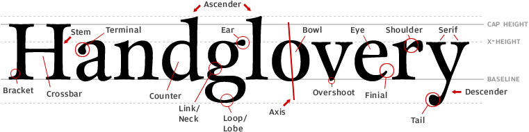
10: Type Anatomy:
It's useful to understand the elements that make up the typography that you will be using, otherwise how do you know what you are talking about when it comes to discussing the elements that make up the type.
It's important to understand the very elements that make up the typography that you will use, then you can have a better understanding of what their purposes are for and why they are used in certain typefaces, such as the between the distinction with Serif and Sans-Serif typefaces.
It is important to understand the individual elements that make up a letter or glyph. Each part must be considered when designing a font or typeface so it is important to know the construction of letters.
The individual structures define letters so that they belong in certain type families such as Serif and Sans-Serif.
Roman
Gothic
Slab
Script
In relation to the different types of type, they all exist to communicate the same way in which speech has accents and different variations. This is why more than just one typeface exists, it's to emulate this. There's large block typefaces to simulate shouting, elegant typefaces to show formality, for whatever situation you need there's probably a typeface that exists to simulate that tone of voice needed.
Of every language there is multiple different ways of hearing it, these exists as different accents and pitches, type similarly mimics exactly this. There exists a font for almost every situation and need to replicate the many different tone of voices you might come to have a use for just like speech, it's the same!
There are lots of different ways in which speech and languages are delivered. There are different accents and pitches that you have to convey through the use of type. A font exists for almost every situation and you have to use these to replicate the many different tones of voice you might hear.
7: What Pantone is:
Pantone is one of many colour matching systems, however Pantone is the most popular of them all. It's used to get the correct specific colours for print and through that you will know exactly what you are getting from having the swatch show you while the printer's can check it against their swatches. Pantone can colours covers a huge range and almost anything can be matched to them.
8: Hierarchy:
'A typographic hierarchy expresses an organizational system for content, emphasizing some data and diminishing others' (Source)
Hierarchy is a means to giving order to information and highlighting the most important pieces first, this can be done through the arrangement of layout or it can be achieved through the use of different typographic elements and adjustments such as: colour, punctuation, fonts, weight and structure of layout.
9: No more than 3 typefaces:
'Every good designer doesn’t use more than a few typefaces and when they’re less good, the number increase. And if they’re worse, then use all of them.' Massimo Vignelli
There is a incredible amount of typefaces that can be used available at everyones dispose. This doesn't mean you need to use them all, as a rule to go by it's best to use no more than 3 typefaces because otherwise you may end up cluttering the type unless it's executed is effective. There is often no need to use more than that.
There are an incredible amount of typefaces that are at anyone's disposal. This doesn't mean that you have to use them all; as a rule it is best to use no more than three typefaces in one piece of design. Otherwise you may end up cluttering the type unless it is executed effectively.
There are an incredible amount of fonts that are at anyone's disposal. This doesn't mean that you have to use them all; as a rule it is best to use no more than three fonts in one piece of design. Otherwise you may end up cluttering the type unless it is executed effectively. However you can still use multiple different typefaces.
Other wise this.
It's useful to understand the elements that make up the typography that you will be using, otherwise how do you know what you are talking about when it comes to discussing the elements that make up the type.
It's important to understand the very elements that make up the typography that you will use, then you can have a better understanding of what their purposes are for and why they are used in certain typefaces, such as the between the distinction with Serif and Sans-Serif typefaces.
It is important to understand the individual elements that make up a letter or glyph. Each part must be considered when designing a font or typeface so it is important to know the construction of letters.
The individual structures define letters so that they belong in certain type families such as Serif and Sans-Serif.
No comments:
Post a Comment